Mr. Minar’s Moving Magic
Designing for a blue-collar service company means communicating reliability first, but Mr. Minar’s Moving Magic wanted to inject joy into an otherwise stressful day.
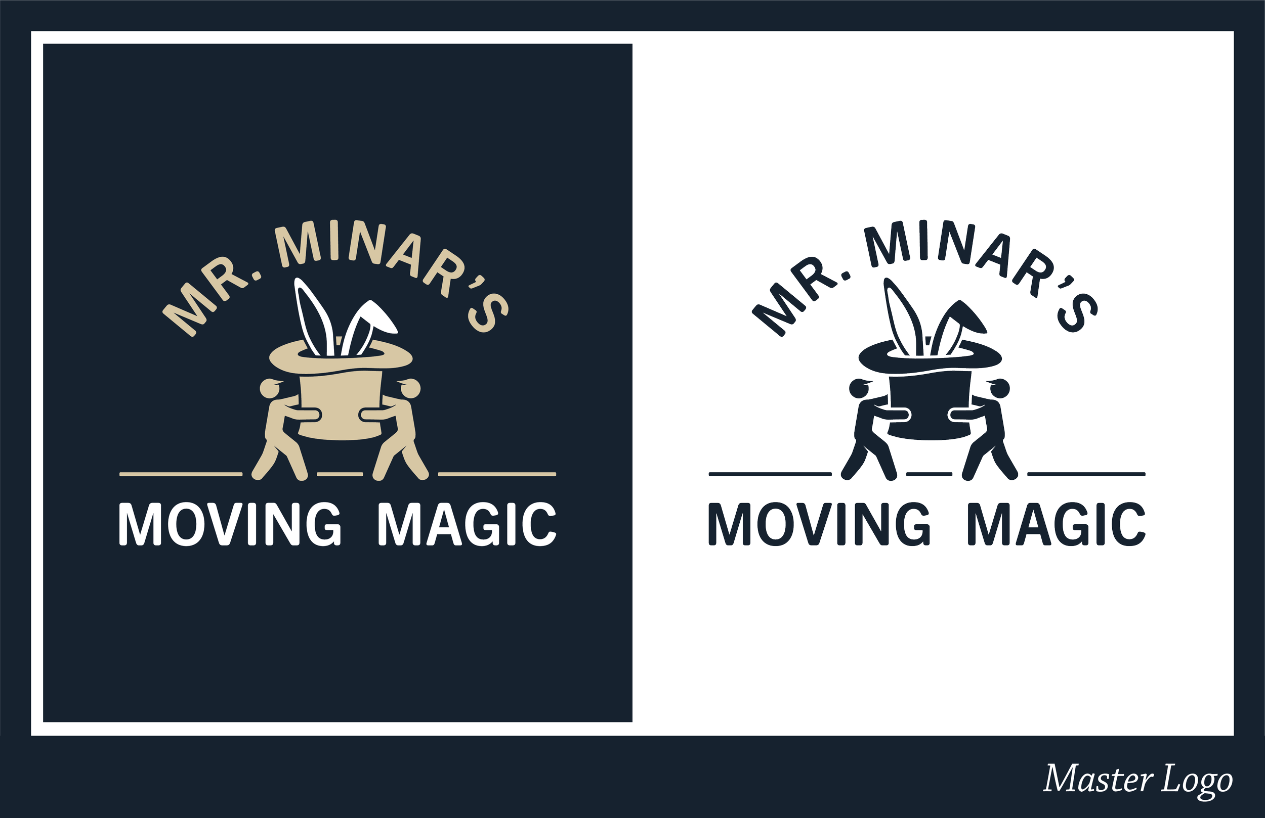
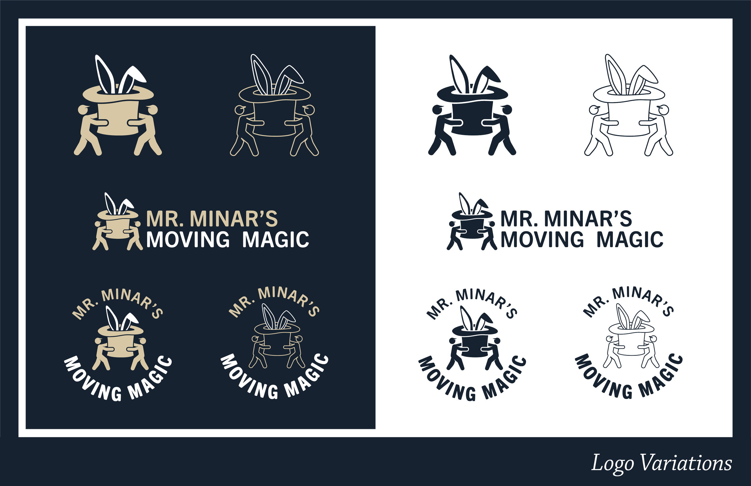
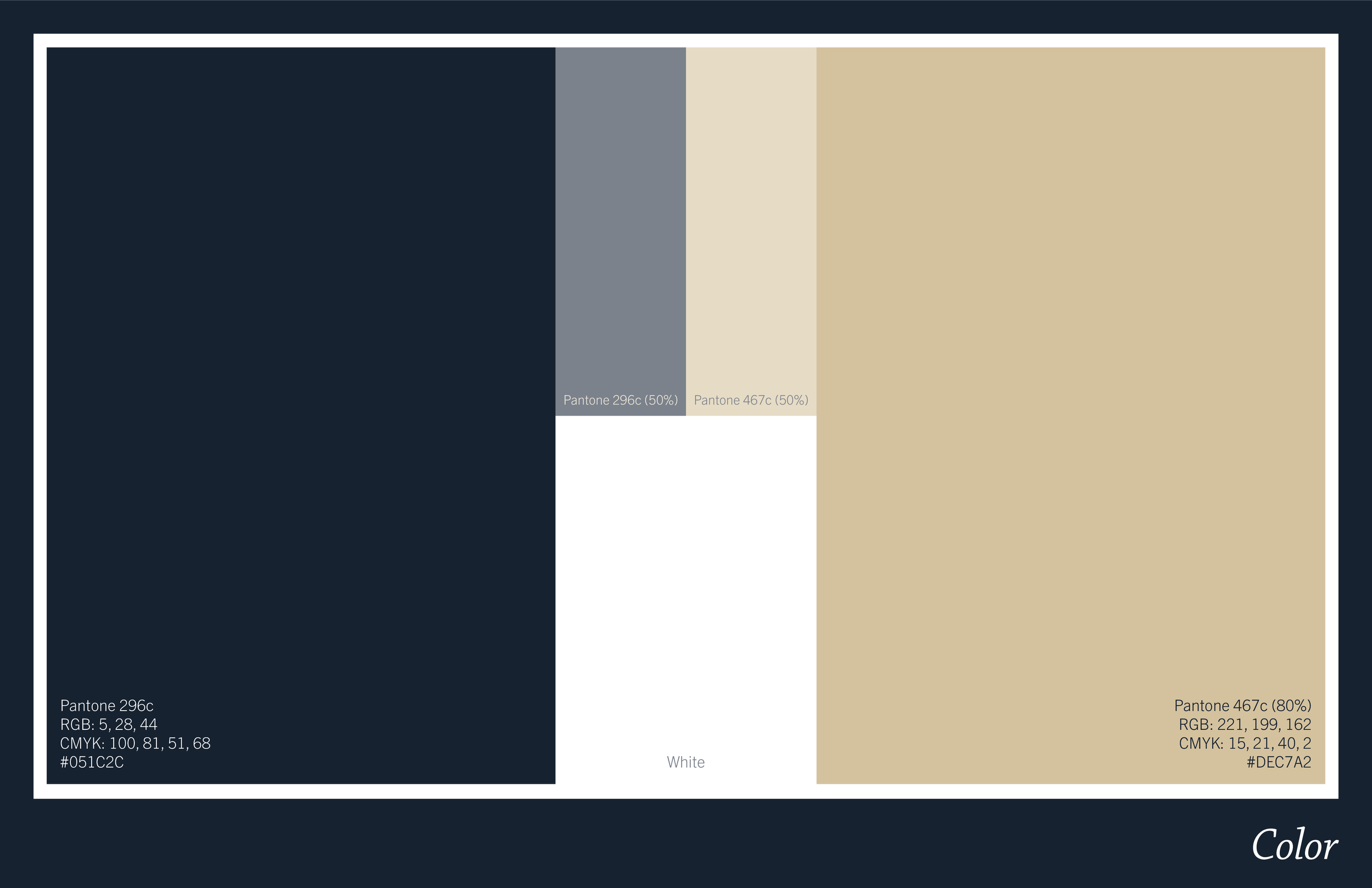
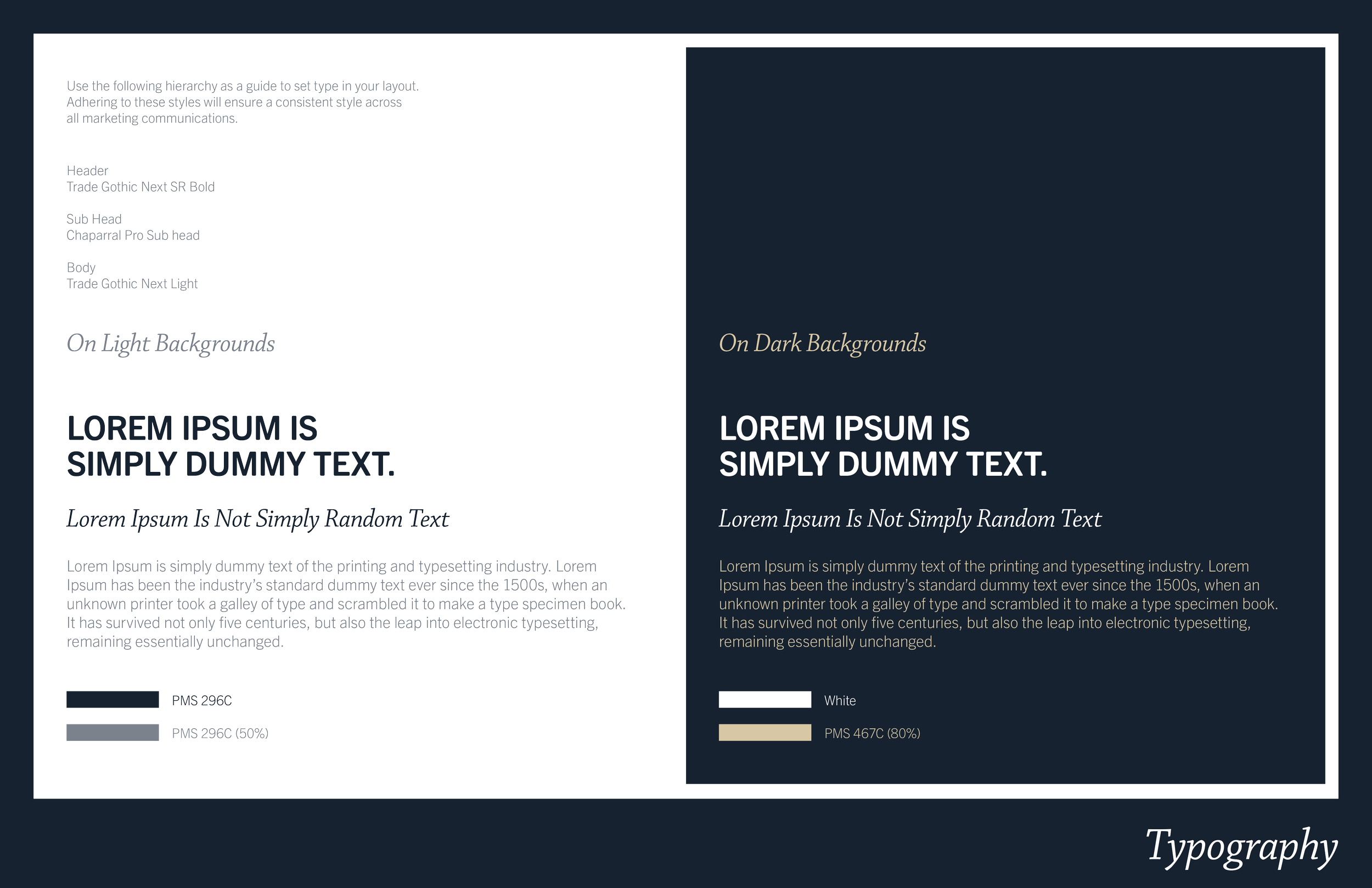
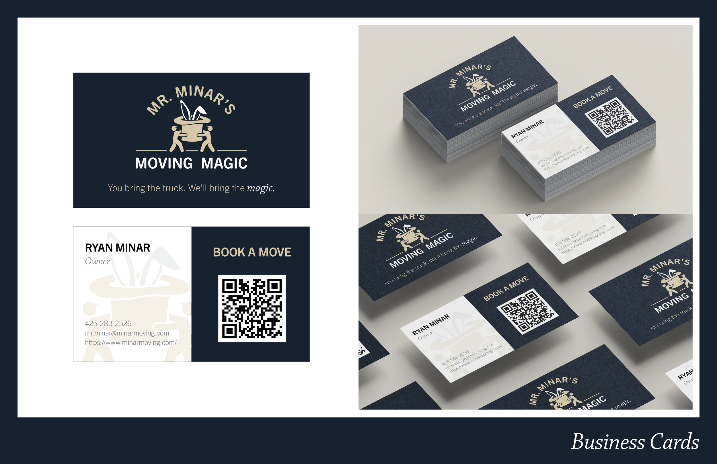
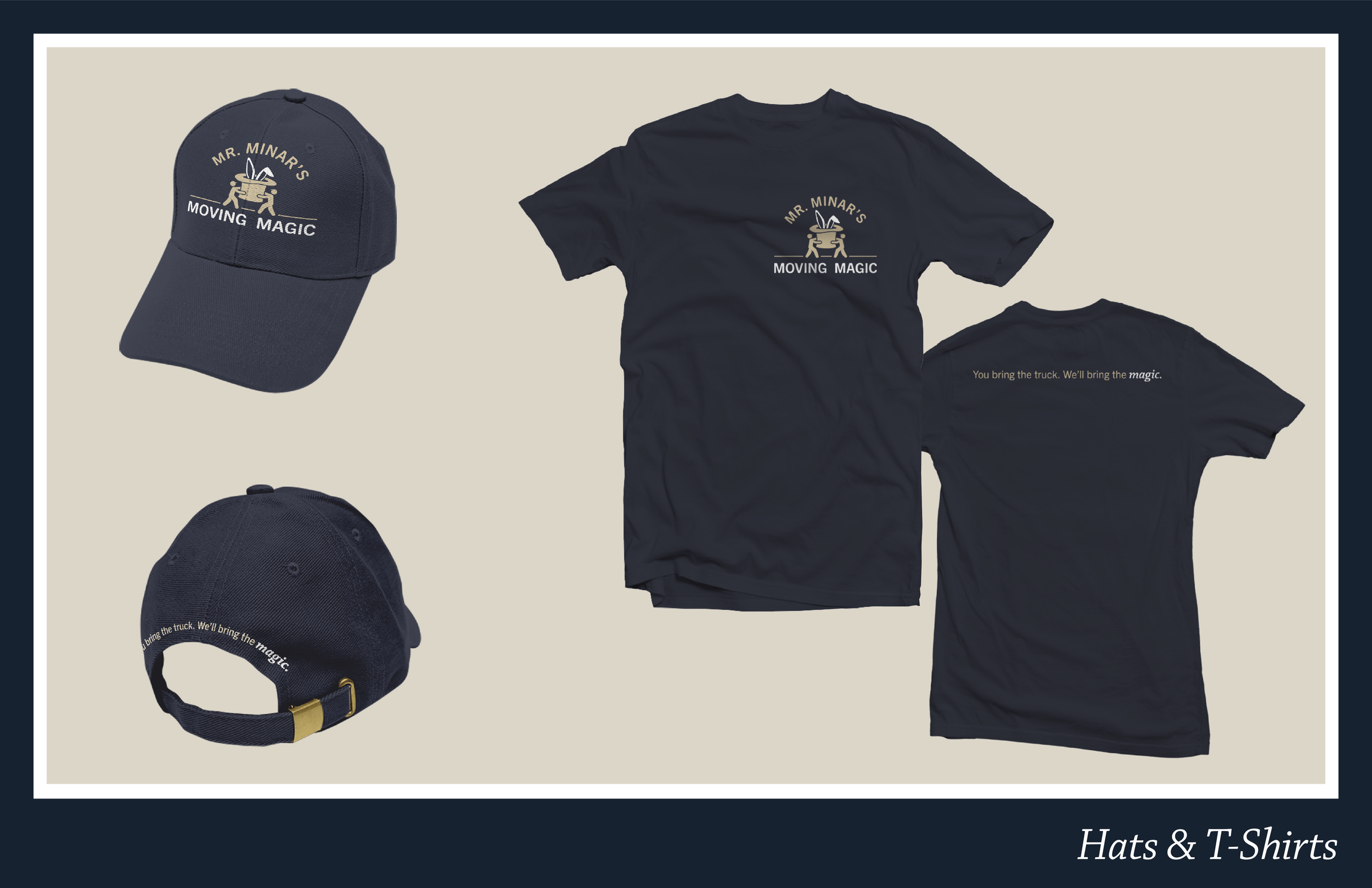
The creative strategy centered around the word "Magic," leaning heavily into a playful character-driven logo. The master emblem features stylized silhouettes working together to lift a heavy magician's hat. To ensure the brand still felt grounded, safe, and efficient, the fun vector illustrations are balanced by clean, highly legible typography and an institutional navy primary color. A flexible system of logo variations ensures the identity scales seamlessly from digital platforms to moving uniforms.